

B2B customers expect more than ever. They want the same slick, intuitive experiences they get from B2C brands, with the added complexity that AI design brings and users constantly questioning what is real, and what is not. B2B users are deeply conditioned to expect meaningful and memorable online experiences regardless of what they’re buying – at home or at work.
Regardless of what they’re buying, at home or at work, B2B buyers are conditioned to expect experiences that are meaningful and memorable, not just functional.
As a result, B2B brands can’t afford to treat their website as an afterthought. It’s the shop window for every piece of brand and digital work you do, so it needs to work as hard as the rest of your marketing.
Take a look at our pick of 9 great examples of B2B web design:
1. Speak to the humans behind the businesses
You’ll lose users straight away if it takes more than 10 seconds from landing on your homepage to actually understand what you do. Buyers don’t want to decode buzzwords, they want to know if you can solve their problem and how.
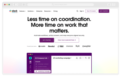
Slack does this straight away – plain language with no jargon, they say immediately the benefit of using them with no jargon. Even the sub copy simply tells users what it is they need, without overloading them.
2. Prove it before they even ask
B2B buyers are naturally nervous, with more than just large quantities of money to justify spending, nobody wants to be the person who champions the wrong vendor internally. They consistently need to prove ROI, and what better way to show that than when you’ve done it before.
Proof points need to be everywhere, and not just hidden on a customer page in the footer. Salesforce consistently showcases these sitewide, making sure they show up at every touchpoint of the user journey, and not just at the end.

3. Stop structuring your site like an org chart
Your navigation needs to be created around what the user needs and not internal politics. Your buyers are thinking about problems and the solutions that solve them – your navigation needs to mirror this intuitively to help the user convert.
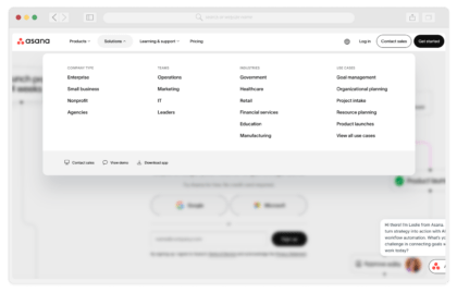
Asana has built their navigation around what people are trying to achieve, not what Asana’s product team happens to be called internally that month.
4. Not all B2B users are the same
You could have anyone from a technical product manager to a CFO visiting your site. Depending on the business, “B2B buyers” can be at all kinds of levels of knowledge and power. Your website has the challenge of needing to speak to all of them.
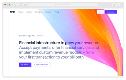
Stripe makes sure their messaging starts broad on key entry points like the homepage, and gets progressively more specific, with clear areas for different use cases and teams, even splitting business types between startup and enterprise.
5. Vague claims convince nobody
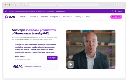
This isn’t just having the proof to back up your claims, it’s that the claims themselves need to be specific. “Boost productivity” means nothing to a user when it’s not backed up by evidence, numbers and real outcomes.
Gong goes into enough detail, with clear outcomes and data that backs it up, not just forgettable buzzwords.
6. Don’t scare users off with a next step they aren’t ready for
It might be “book a call with our sales team” or “sign up for a free trial,” the fact is most B2B users aren’t ready for that level of commitment, and even those who are don’t want to actually speak to anyone over the phone to get an answer. In a world full of users scared to pick up the phone, give them an option not to.
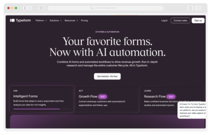
Typeform offers an easy free way to get started, with automated login options that link to the user’s other accounts. They combine low commitment, ease and no commitment in a way that users can’t resist.
7. A fast and accessible site is essential to avoid deterring users
A slow, clunky site quietly tells visitors “this is what working with us will feel like.” That’s not the impression anyone wants to give.
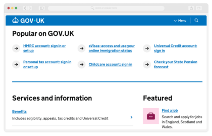
GOV.UK isn’t a B2B site, but is the gold standard for how to build for accessibility and speed at serious scale, whilst still feeling considered.
8. Consistency is quietly doing a lot of trust-building
Mismatched fonts, colours, or components might seem trivial, but to a buyer sizing you up as a potential partner any sloppiness here can make them think that reflects your operations as well.
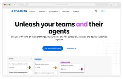
Attlassian keeps its visual system clean across its marketing and many products, keeping a consistent visual language across all user touchpoints so everything feels like it came from the same confident, capable team.
And finally
9. AI-generated design can build fast, but it can’t build trust
AI website builders make it painfully easy to spin up a site in an afternoon, but “easy” and “good” aren’t the same thing. These sites tend to have a recognisable look: generic hero sections, oddly generic stock imagery, a slightly-too-tidy layout that feels assembled rather than designed. Buyers may not be able to name it but they know something is off, and the generic feel can mean you blend into the background rather than stand out front and centre against competitors.
The technical debt is often worse than the visual tell. AI-generated sites frequently ship with bloated code, poor semantic structure, accessibility gaps, and SEO foundations that were never properly considered, just output that looked plausible in a preview window. What feels like a shortcut at launch usually becomes a rebuild six months later with big sales left on the table.
In a world of generic, remember your website is where you can stand out, and bring the personality back into B2B. Here are some final examples to inspire your B2B web design.
Here are three examples known for genuinely considered, human-crafted design:
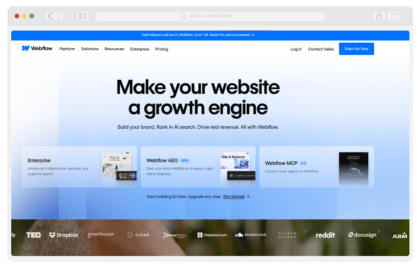
Webflow: Fittingly, given the context. Confident typography, purposeful motion, layouts built for each section, not dropped in from a template. Proof a website builder can still look distinctly designed.
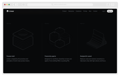
Linear: Sharp, minimal, unmistakably its own thing. Dark UI, tight typography, motion that feels engineered, not decorative. One of the best-designed SaaS sites going, and it knows it.
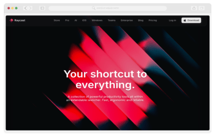
Raycast: A distinctive dark aesthetic with sharp illustration and a strong sense of brand personality throughout.
Ready to build a B2B site that actually converts?
Great B2B web design isn’t about chasing trends or ticking boxes, it’s about building trust, cutting friction, and giving buyers the confidence to say yes. Get in touch with our team to talk through your B2B web design project, and let’s build something that actually converts.