
The client
Phoenix Hospital Group is a cluster of private hospitals, clinics and specialist facilities across the UK, brought together under a single group brand. Like many private healthcare providers, they sit alongside established names such as Nuffield Health, HCA, Spire, One Welbeck, Benenden and Ramsay Health Care – but unlike most of their competitors, Phoenix operates on a deliberately smaller, more consultant-led scale.
The challenge
When Phoenix came to Hallam, they were looking for a unified brand, internally and externally, and needed a much more solid brand positioning and value – the kind of positioning that could apply to almost any private hospital group. Because Phoenix had been formed by bringing together a number of individual hospitals and clinics under one banner, there wasn’t yet a coherent brand identity to unite them: logos were inconsistent or non-existent at a group level, and internally there was real uncertainty about how to articulate who Phoenix actually was.
The original plan had been to move straight to a new website. It became clear that a website built on unclear foundations would only carry that confusion forward. Phoenix needed brand clarity first, a genuine point of difference from the competition, before any conversation about digital execution could be worthwhile.
What we did
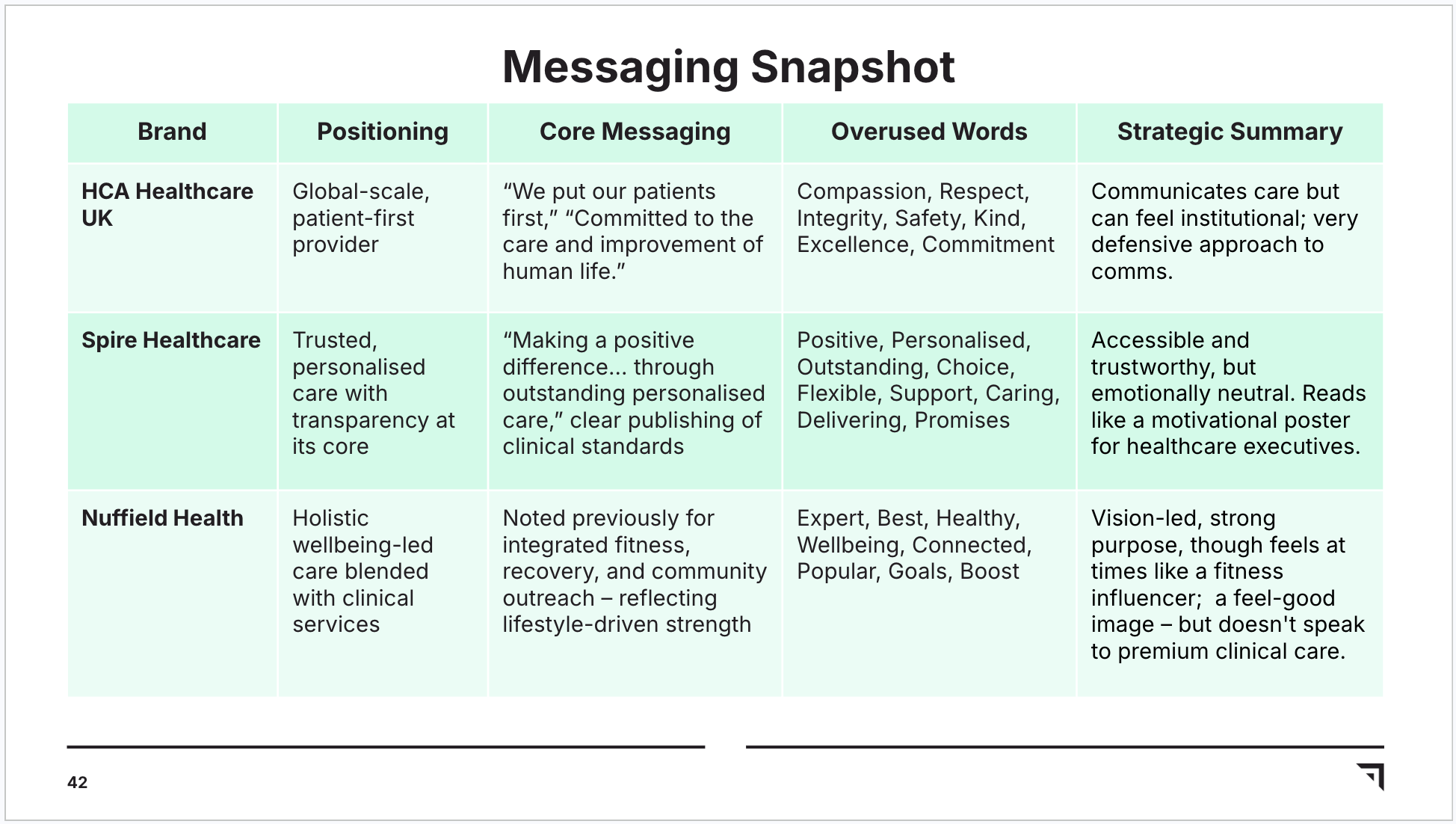
We started with research, not assumptions. Using AI-powered sentiment analysis, we interrogated over 4,000 online reviews of Phoenix and its key competitors pulled from Google reviews and Doctify, the Trustpilot-equivalent for medical care, to understand what patients actually experienced, rather than what brands claimed about themselves. We paired this with internal interviews across the business, from frontline staff to consultants and leadership, and layered in a competitor messaging audit to map the language everyone else in the category was using (and, just as usefully, the language to avoid).
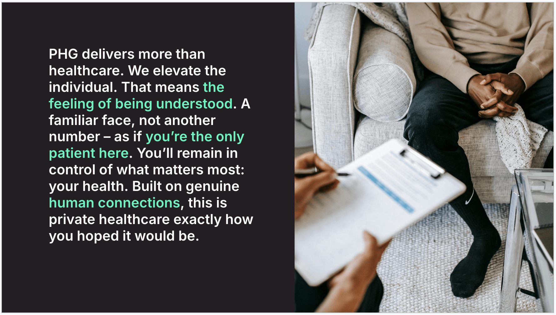
That research surfaced something distinctive. Across thousands of reviews, patients consistently described Phoenix in terms of warmth, personal recognition and human connection – while competitors, for all their scale and clinical credentials, came across as comparatively transactional and corporate. Where the wider private healthcare category leant on interchangeable language like “personalised care” and “trusted experts,” Phoenix’s own reviews told a more specific story: patients felt like the only patient in the building.
We used this to define three priority audiences that would drive the brand and, eventually, the website: the Prestige Patient (affluent, discreet, expecting five-star service), Insured & Informed patients (pragmatic, time-poor, consultant-led) and, critically, Consultants themselves. Private hospital groups compete for consultants as much as patients, since a consultant’s choice of hospital directly shapes patient volume and reputation, so we treated this as a genuine second brand relationship rather than an afterthought.
From there, we built a positioning platform “Premium healthcare that elevates the individual” for patients, with a parallel version for consultants, anchored in three brand truths: Recognition, Agency and Prestige. We also went further than a typical brand engagement by reworking Phoenix’s internal vision, mission and values, so the leadership team had a shared, meaningful articulation of the business to align around internally, not just an external-facing message.
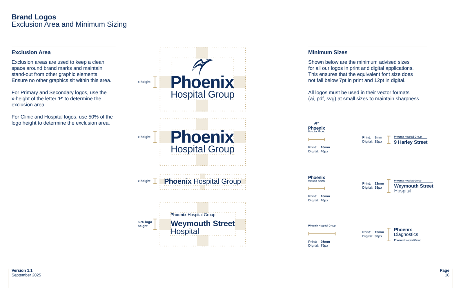
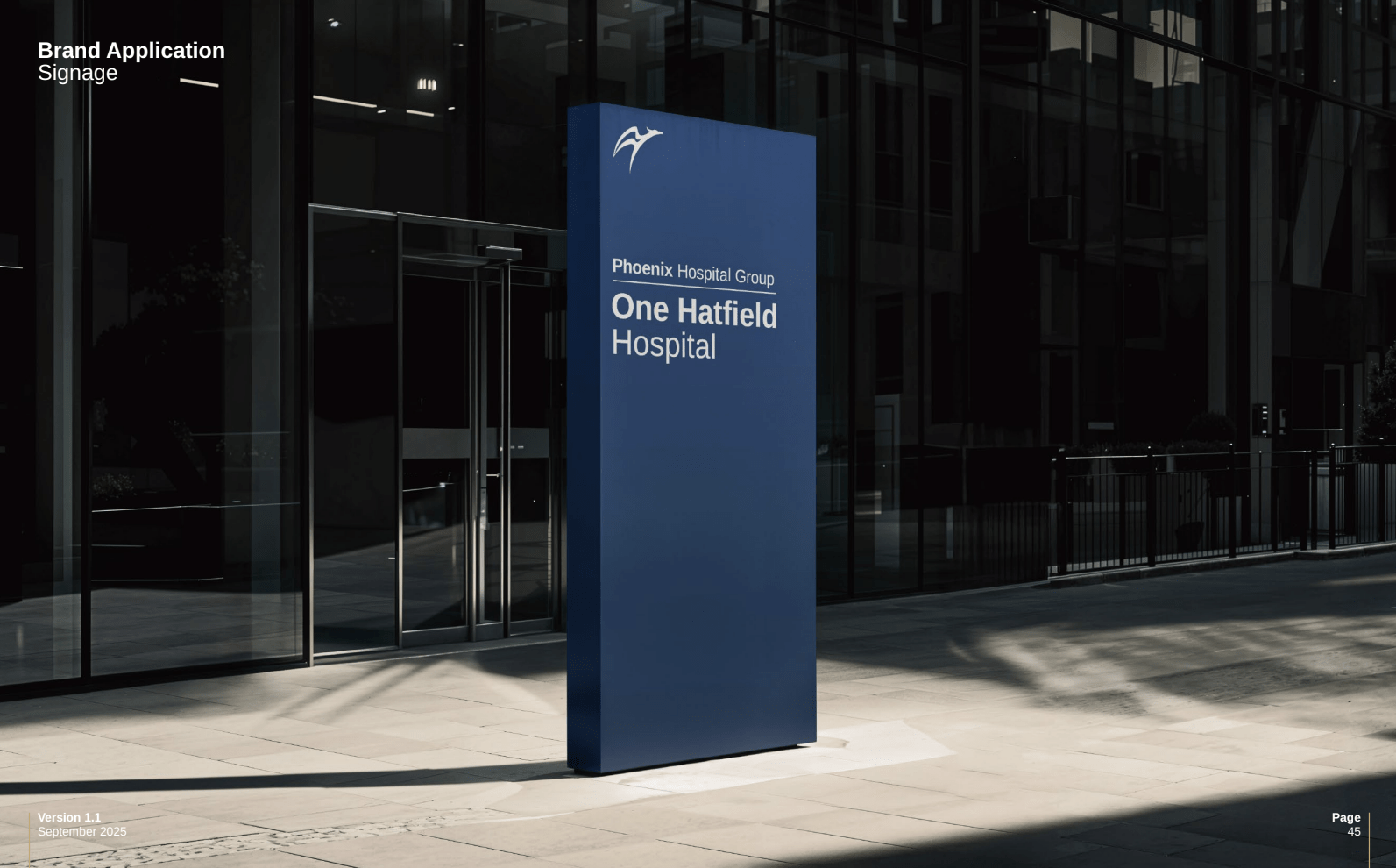
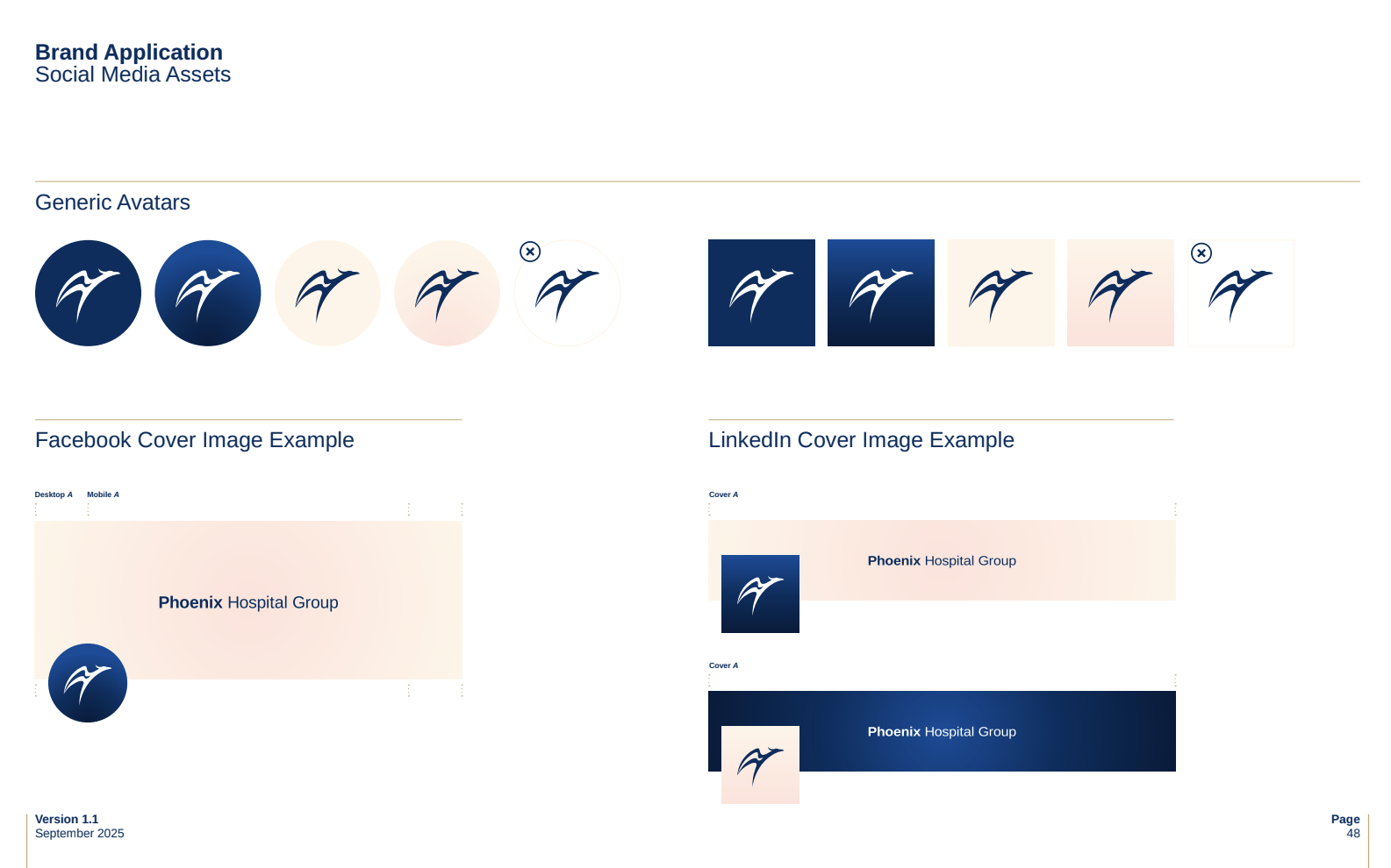
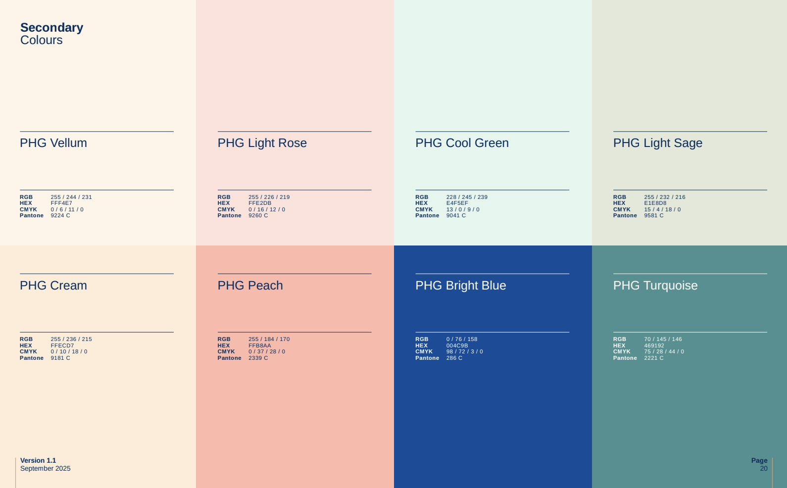
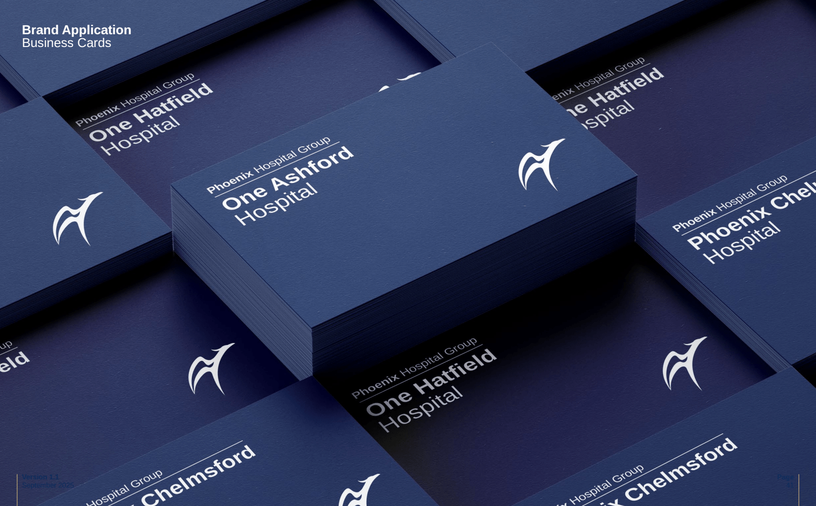
That strategy then fed into the visual identity work. We translated the positioning into a look and feel that consistently evokes a boutique hotel rather than a clinical institution: a navy-led palette softened with warm secondary tones, and photography that favours genuine human moments over sterile, corporate imagery. The resulting brand guidelines cover everything from the primary and secondary logo lockups (needed to accommodate the many individual hospitals and specialisms sitting under the Phoenix name) through to business cards, signage, brochures and social assets – a full toolkit for Phoenix to apply consistently across every touchpoint.

“Phoenix made me feel like they had all the time in the world, even though I knew they were busy.”
Patient review, sourced during our sentiment research
Where this leaves Phoenix Hospital Group now
This was brand strategy and visual identity work, deliberately built to unlock what comes next – most notably a website that finally reflects the brand rather than sitting apart from it. Whilst a new website is in the works, what we can point to is a private hospital group that, for the first time, has a genuinely distinctive, evidence-based brand: one grounded in over 4,000 real patient voices rather than the same “compassionate, personalised, trusted” language every competitor runs with – and a clear foundation ready for Phoenix to build on whenever they choose to take the next step.
“You did a fantastic job picking up the branding for us… you really went above and beyond in terms of that piece of work and if I was in a position to want a piece of work like that doing again, I would certainly be coming to you guys. From my point of view, you’ve been fantastic and you’ve maintained your composure and professionalism and everything else throughout.”
Sue Dover, CMO of Phoenix Hospital Group
Be chosen before the search begins
Stop playing it safe and start working with us to create marketing that earns attention, builds trust and puts your brand ahead of the competition before buyers even start looking. To escape the ordinary and become truly unforgettable, all you have to do is get in touch.