
The client
FlowForma is an enterprise process automation company headquartered in Dublin, with offices in London and the US. Its flagship platform is an AI-powered, no-code tool that helps organisations build, automate and optimise business workflows natively on SharePoint Online and Microsoft 365. In effect, it’s the glue between the systems large organisations already use. It takes processes that sit in documents, spreadsheets and email and turns them into secure, governed, automated workflows.
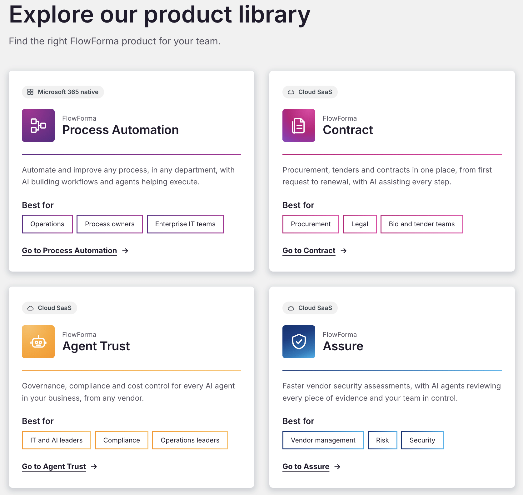
Over the past year, FlowForma has grown from a single platform into a library of products. Alongside Process Automation, it now offers FlowForma Contract for procurement, tenders and contracts, Agent Trust for governing AI agents from any vendor, and Assure for AI-powered vendor security assessments. Its customers are typically in highly regulated sectors such as healthcare, construction, education, financial services and the public sector, and the platform supports business-critical processes for more than 300,000 users.
The challenge
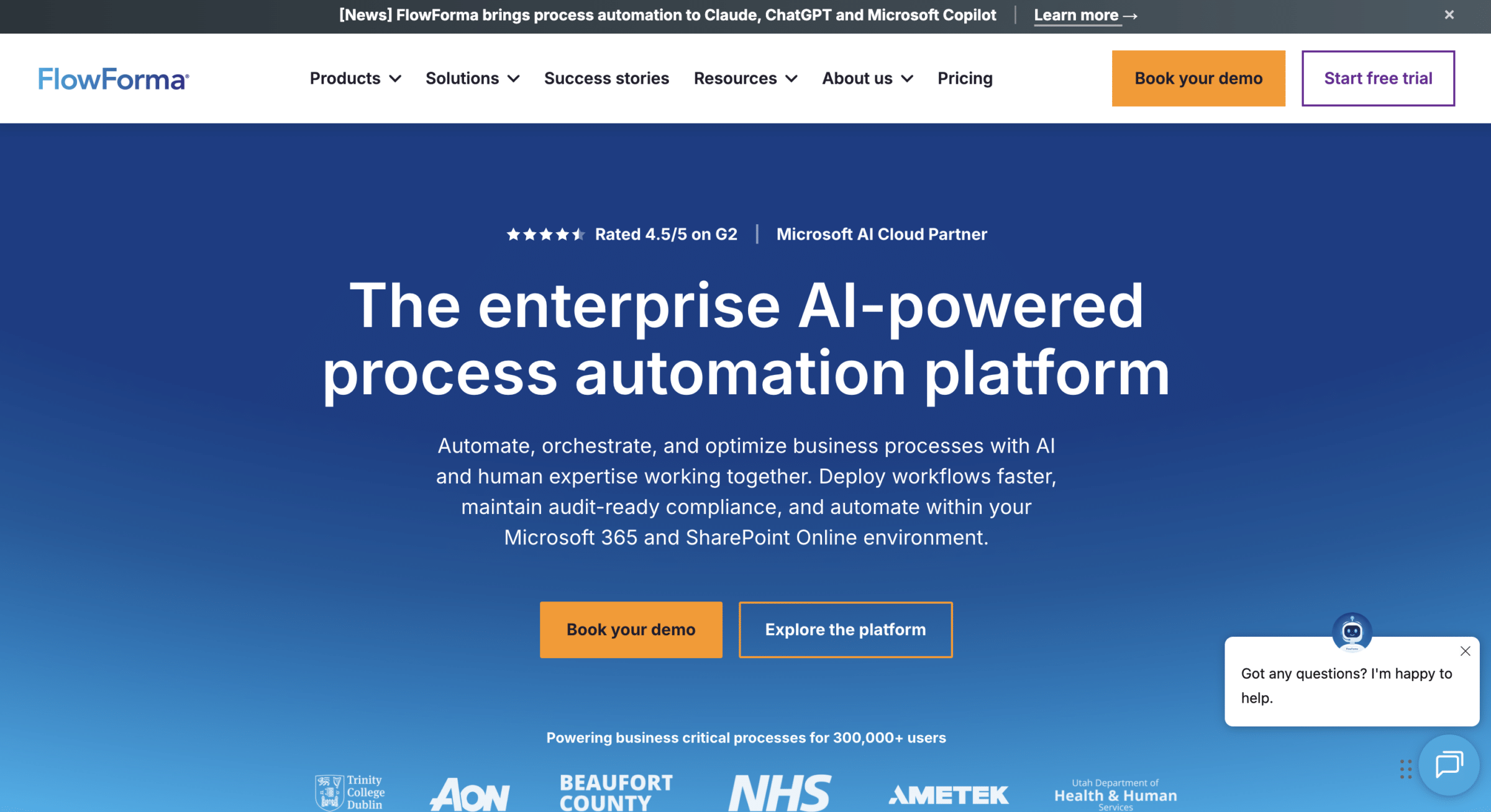
FlowForma sells cutting-edge AI products, but its website didn’t show it. The site was static and visually dated. Pages were content-heavy and repetitive, often with so much information on one screen that visitors couldn’t tell what FlowForma did at a glance. The branding showcased inconsistencies, and much of the copy and layout relied on AI. We used our UX and UI expertise to showcase FlowForma as who they really are – a trusted brand in the AI-product space.
The conversion journey added more friction. Several CTAs competed for attention and often led to the same outcome. That made sense for the internal sales process but confused visitors about what to do next.
There were also practical constraints. FlowForma’s marketing team had limited time and budget, and no in-house development team. Any improvements had to be quick to implement and easy for the team to roll out themselves using AI-assisted coding.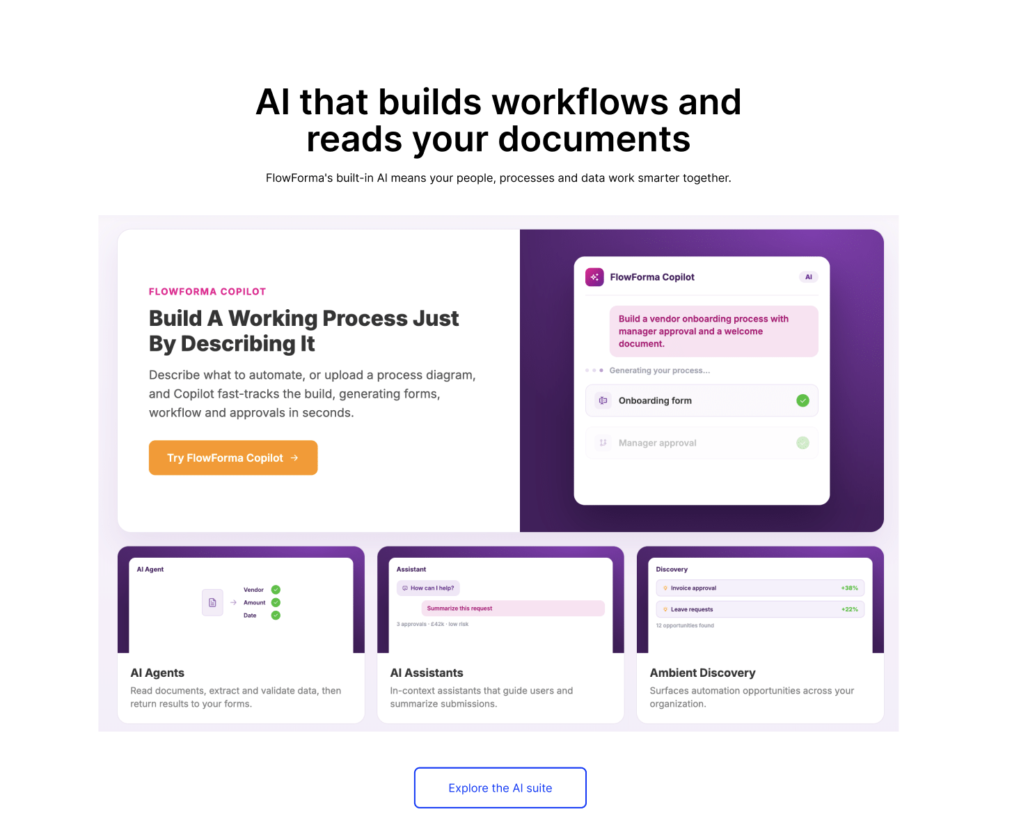
What we did
When the account was reset in July, Hallam recommended moving budget away from paid search into UX following data analysis from our Data & Insights team. Rather than chasing more traffic, the priority became making the most of the visitors who were already arriving.
Our UX team started with an evidence-led audit of the paid landing pages, the site as a whole and the homepage. Before designing anything, we stepped back to map the information architecture and what FlowForma needed to say. We then built a modern UI around it.
The homepage came first. We stripped it back, reworked the copy hierarchy and replaced the mismatched styling with something more distinctive. We introduced more colour, imagery, video and varied content types, staggered down the page so users are guided rather than overwhelmed. Trust signals were spread through the page, and signposting moved higher so users could get deeper into the site faster. We also established a consistent visual language, including button hierarchy, colour and spacing, that could be applied to every page.
The mega menu came next. It was redesigned to make information visible rather than hidden behind hovers. Pricing and success stories were brought into the main navigation because data showed they were reassuring users, and contact and support moved into a separate utility nav.
We then focused on conversion. Consolidating the CTAs into one clear structure, with demo booking as the primary action and FlowForma’s interactive Playground as the route for visitors who want to see the product, removing gated content and barriers from the user journey to help overall conversions. We redesigned the demo page so the calendar opens on the same page rather than redirecting elsewhere, making the journey feel continuous. We also used Microsoft Clarity heatmap data to shape recommendations for the Playground. Visitors were four times more likely to use prefilled prompts than to type their own, so we recommended more guided, filterable options, to make the next step for the user clear, rather than making them do all of the thinking.
A big part of the project’s pace came from how we worked with FlowForma’s team. Whilst we owned the design, FlowForma’s team built the pages themselves using AI tooling, working from a design tokens export that let new pages be created in the established visual style. Without the usual handoff to a large development team, designs went live in days rather than weeks.
The results
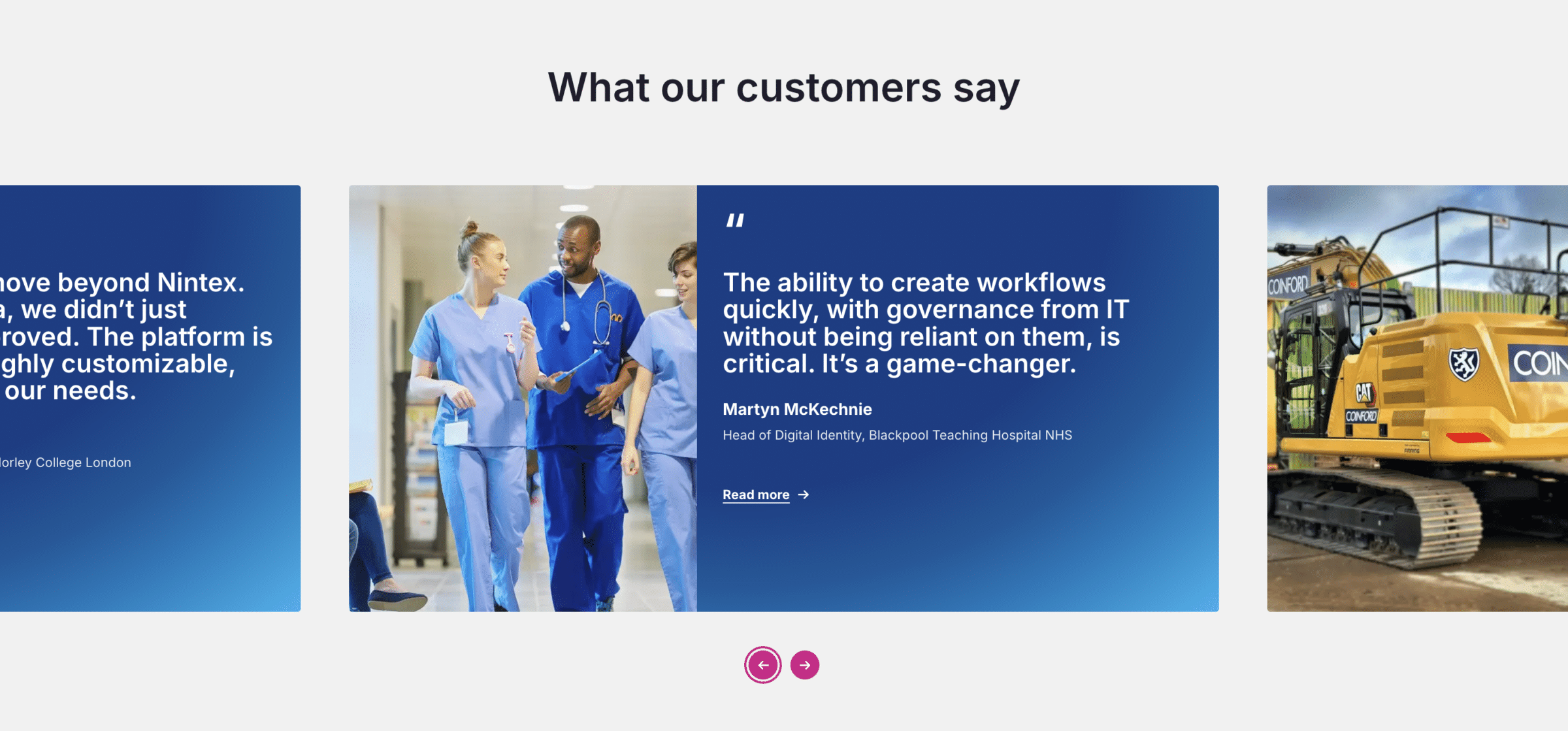
In a matter of months, FlowForma went from a dated, cramped website to a modern, consistent site with a clear visual identity. The homepage, mega menu, CTA structure, demo page, platform pages and new product pillar pages are all live. Plus more pages are in the works as the site continues to be updated with the new design system we have provided.
Early signals were encouraging. Engagement on mobile rose after launch, and time on page increased after the redesign went live. FlowForma’s team also reported that the leads coming through were of better quality, more engaged and of higher value.
The biggest outcome, though, is the system. With limited time, budget and no development resource, FlowForma now has a design framework and reusable templates its team can apply across the rest of the site. They can keep updating and expanding it independently, in a visual style that properly represents an AI product company. Plus, the website now meets and complies with the WCAG accessibility standards we strive for.
The project also showed the value of working with an integrated agency. When paid search wasn’t the right lever, we moved the budget to where it could make the most difference. UX worked hand in hand with our SEO and data teams so that design, content and measurement all pointed the same way.
“FlowForma’s product is genuinely forward-thinking, but their website wasn’t telling that story. Our job was to strip it back, make it clear what they do in seconds and give them a visual identity that actually stands out in a crowded AI market. The bit I’m proudest of is that we didn’t just hand over pages. We gave their team a system they can keep using long after we’ve finished.”
Ellie Swain, Creative and Experience Designer at Hallam
Be chosen before the search begins
Stop playing it safe and start working with us to create marketing that earns attention, builds trust and puts your brand ahead of the competition before buyers even start looking. To escape the ordinary and become truly unforgettable, all you have to do is get in touch.