

Have you ever landed on a website for a brand you thought you knew – only to wonder if you typed the URL wrong?
Maybe the brand’s social presence is confident and full of personality, but the website feels like it hasn’t been touched since 2014.
Or maybe the brand claims to be “premium”, but the site is cluttered, slow and full of generic stock photos.
Perhaps you’ve invested in a fresh new brand identity – something vibrant, expressive, and full of energy – only to apply it to the website and watch it fall completely flat. Suddenly the brand that felt so alive in the pitch deck feels muted or strangely generic when translated into digital form.
It’s jarring. And it happens more often than you’d think.
Many teams spend months crafting a beautiful brand identity: the strategy, tone, visuals, messaging, all wrapped up in a polished brand playbook. But taking that identity and bringing it to life online is a different challenge entirely. Budgets shift. Old components linger. Legacy pages stay untouched. New content gets bolted onto outdated templates. And before long, the digital expression of the brand stops matching the energy and intention behind it.
The result? Confused users, mixed signals and a quiet sense of distrust that’s hard to shake. People might not be able to articulate what feels “off”, but they certainly feel it.
And here’s the truth: users believe the experience they have, not the one you imagined. If the website doesn’t deliver on the brand’s promise, the promise starts to lose its power.
Let’s talk about why this gap forms – and more importantly, what it takes to close it.
Your website should be the living expression of your brand
A brand is more than a logo or a colour palette. It’s the promise you make to your customers and the feeling you want them to walk away with.
And your website? It’s where that promise gets tested.
If your brand says “we’re innovative”, but your website looks like it’s stuck in the past, the message falls apart. If your brand claims “simplicity”, but your website feels cluttered, users question the credibility behind that claim.
The strongest brands treat their website as the most visible, interactive and emotion-rich extension of who they are.
The experience gap: where branding stops and UX begins
Here’s a common problem: brand and UX teams often work in totally different worlds.
Brand team: “We want to feel bold, human, empowering.”
UX team: “We want everything clear, simple, structured.”
Both perspectives are valid, but when they don’t collaborate, the experience becomes fragmented.
That’s where the “experience gap” shows up. You’ve probably seen it before:
- A beautifully branded homepage followed by a confusing sign-up flow
- A strong, distinct tone but robotic microcopy
- A sleek visual identity but outdated patterns and clunky interactions
When branding and UX operate in silos, the experience never feels truly cohesive.
Why consistency builds trust (and inconsistency breaks it fast)
Humans love patterns. When something feels consistent, our brains relax and we know we’re in the right place.
But inconsistency? That instantly triggers doubt.
If your social presence is playful but your website feels stiff and corporate, users question which one is the “real” you. If your visuals evolve but the website still shows the old look, something feels off.
And “off” is all it takes to erode trust.
Consistency doesn’t just look nicer – it creates confidence.
Your website is a key part of the whole brand journey
A lot of teams still think of the website as “just one channel”.
But your website often sits at the most important decision-making point in the journey.
Someone might discover you on social media, click an ad, explore your site, read a blog, and then sign up or purchase. If the website doesn’t match the tone or promise that got them interested in the first place, they bounce.
Your website needs to echo the same energy and personality as every other touchpoint. When it doesn’t, you build up “experience debt” – those tiny disconnects that gradually undermine trust.
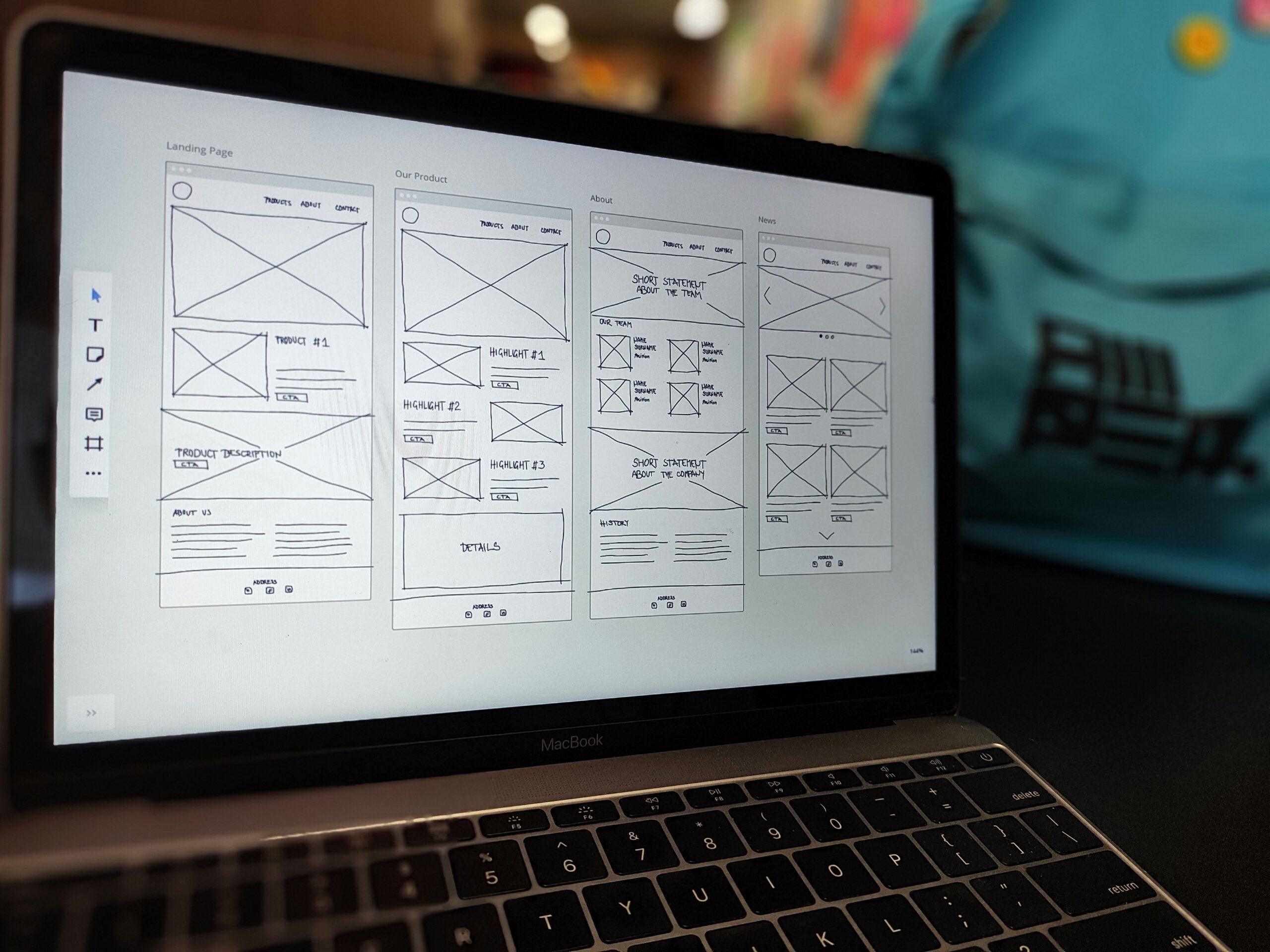
From brand kit to website UI kit: turning assets into a practical digital system
A brand kit gives you the ingredients, but building a website requires a full recipe. Here’s the streamlined path from brand assets to a usable, consistent UI kit.
Step 1: Start with the essentials
Review your logo, colours, typography, imagery and brand personality. Define the digital feel you want to create before touching UI elements.
Step 2: Expand the colour palette
Adapt brand colours for digital use by adding contrast pairs, semantic colours (success, error, warning), and lighter/darker shades for backgrounds and interactive states.
Step 3: Build a responsive type scale
Turn brand fonts into a usable system: headings, body sizes, labels, spacing and responsive rules. This keeps typography clean across devices.
Step 4: Establish layout and spacing rules
Define your spacing scale, grid, breakpoints and any elevation/shadow patterns. These invisible rules make everything feel consistent.
Step 5: Translate personality into interaction
Decide how the brand should behave digitally – motion levels, corner radius, easing, microcopy tone and interaction style. These details bring personality to life.
Step 6: Build the core components
Create essential building blocks such as buttons, forms, cards, navigation, banners and modals. Keep them scalable and aligned to the brand’s character.
Step 7: Define and systemise imagery
Your imagery – whether it’s photography, illustration, icons, or graphics – plays a huge role in how users emotionally understand your brand.
Decide on:
- The style of imagery you use
- The mood, lighting or composition
- Whether imagery should feel candid, polished, playful, minimal, diverse or conceptual
- How graphics or illustrations should be shaped, shaded or coloured
Once defined, apply the rules consistently across the website. Imagery inconsistency is one of the quickest ways a brand starts to feel fragmented. When images follow a clear system, the entire experience feels more intentional and recognisable.
Step 8: Assemble real layout patterns
Combine components into page-level patterns like hero sections, feature layouts, pricing blocks and footers. This shows how everything works together.
Step 9: Document how it all works
Add usage guidelines, accessibility notes, do’s/don’ts and include examples. A UI kit is only useful if everyone understands how to use it.

Bringing it all together
Bridging the gap between brand and website isn’t about making things prettier. It’s about creating a cohesive, trustworthy experience where the digital side of your brand actually reflects who you are.
When you close this gap:
- Your messaging becomes clearer
- Your experience becomes smoother
- Your brand becomes stronger
- Your users feel more confident
Your website stops being a standalone channel and becomes a true extension of your brand – a place where identity and experience work together seamlessly.
Are you looking to revamp your brand and website experience cohesively? Get in touch today.