Many people may think there isn’t much to typography – it’s just words, right? Well, that’s where they couldn’t be more wrong.
As Ellen Lupton explains in ‘Thinking with type’: “Typography is the convergence of art and language. This makes it hugely powerful as a tool and a means of expression.”
Typography is meta-expressive; it’s what adds an extra layer of meaning on top of the word itself, almost giving the words a voice. This means that you could even have words in a different language you couldn’t understand and still be able to infer some sense of meaning from the typography alone. When it comes to considering a new or revised typeface for your brand, here’s what you need to know.
Font vs typeface
So, what’s the difference between font and typeface? A typeface (also known as a type family) refers to the collection of fonts that make up that family; the font is the specific style within a typeface.
For example, as shown in the example below, the Roboto typeface is made up of multiple fonts, each with varying weight and width.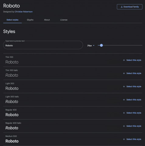
Anatomy of a typeface
When it comes to understanding a typeface and making Creative decisions about what to best use for your brand, it’s helpful to acknowledge the various decisions around a typeface’s anatomy.
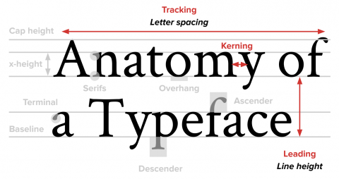 Leading
This is also referred to as line-height. It controls the space between each line within a paragraph.
Serif vs Sans Serif
Serifs refer to the decorative stroke that sometimes comes at the end of a letter’s stem, like feet. You tend to see this font in historic settings because stone-chiseled letterforms needed these ‘feet’ to stop the stone chipping around the 90-degree edges. Serif fonts (see the ‘T’ on the right, in the image below) are often considered to be more formal and traditional as a result of this historic association.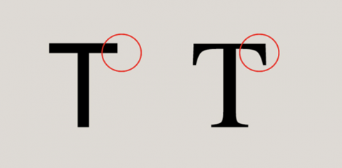 Conversely, sans serif simply means that a letter doesn’t have these decorative strokes, having stolen ‘sans’ from the French for ‘without’. Instead, sans serif fonts have clean-cut ends, whether that’s a perfect 90-degree angle or curved ends, seen in the image above, on the left.
Tracking
This is the space between the letters of a word in equal increments.
Kerning
This refers to the space between the individual letters of a word. The same measurement doesn’t have to be used for each letter within the word as there can be allowances and adjustments made based on particular characters that require more space.
In this instance, the designer of this packaging could have really benefitted from increasing the kerning between the ‘L’ and the ‘I’…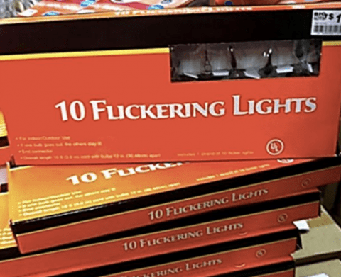
But it’s not all about being really, really good looking…
When it comes to working with fonts, you need to avoid being like the infamous film character of Derek Zoolander: being all style, no substance. There’s various elements that need to be considered in order to make sure your font is working for you – and not against you.
Here’s what you need to consider.
Utility
It’s important to use a typeface that reflects the brand and instills the correct emotions in the correct audience, however, a font’s main purpose can’t be ignored – if nobody can read it, then it’s not serving its intended purpose.
In ‘The complete manual of typography’, James Felici states: “The beauty of type lies in its utility; prettiness without readability serves neither the author nor the reader.”
For your choice of typography to be effective, it must prioritise:
- Legibility
- Readability
- Size
Structure
When choosing a typeface for your brand, you need to consider the difference between your headline copy and your body copy.
Don’t feel forced to stick to the same font for both; depending on the font, you can use different typefaces for the headline and body copy or stick to the same typeface and use a different font from within it to differentiate the headline and body copy. For example, for headlines, it’s ok to use more ‘display’ faces that may involve script or be more flamboyant as a headline will usually only consist of a handful of words. The body copy, however, needs to be clear and legible, so display faces wouldn’t be appropriate.
Often, in a design rollout, examples of all variations of a headline will be displayed so you can get a clear picture of how they all tie together, like the example below: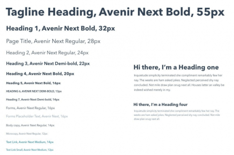
Final thoughts
Not only are the words you’re saying important but what those words look like carry a lot of weight, too. Both the words themselves and the style used to convey them carry meaning and it’s important that you think about what that meaning is so that it reflects the values and personality of your brand.
The typeface is just as much part of your brand as your colours and logo – so choose wisely. But most importantly, make sure people can read it!
