There is huge value in looking at Google Analytics across multiple businesses and multiple accounts. If you are lucky enough to have access to this data then you can use it to take a more in-depth look to identify opportunities for improvement as well as spotting high performers.
But there are some very basic errors in analysis you need to avoid, and some simple tips to get the most out of your data.
Here are the steps you need to take to get started, and a case study of how we used this methodology to analyse the performance of our Hallam client accounts post-COVID.
Assembling the Data
The first step in the process is to gather the data from the accounts to be analysed.
To do this, we tapped into the Google Analytics Reporting API. The Google App Scripts is quite straightforward and well documented, as all of Google’s services play nicely on the platform. So, taking data from Google Analytics (GA) and putting it into Google Sheets should be relatively easy.
The objective is to produce a sheet listing all of our accounts to be analysed, and the correct View IDs.
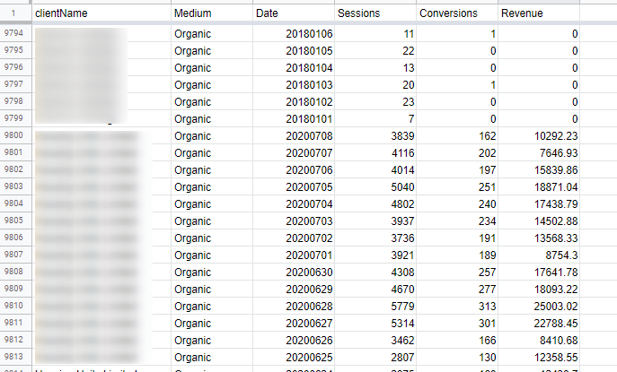
The next step is to iterate through every single relevant Google Analytics account we manage and, via the API, get them to spit out the relevant data into one place. For the purpose of this analysis, we are exporting traffic data, conversion data, revenue data.
This can go straight into a simple Google Sheet for our intermediate data storage because it’s nice and easy to work with. For maximum scalability, however, proper Data Warehousing should be used (e.g. Google Big Query).
But, that’s the hard part – now let’s move onto the fun bit. We’ve got all the data for all our clients into one big giant super-large table. It’s graphing time.

There are a number of different ways to analyse performance between accounts, and looking for indicators of improvement in performance. So, as a first pass at this, we could take a 3 month period across all accounts and compare it to the same 3 month period from the previous year. This should tell us by how much has the performance improved.
Errors in Analysis
There is however a pitfall here. What we don’t want to do is to sum up all the sessions from Q1 2020 and compare them to Q1 2019. If we were to do this, whatever the performance was for one of the largest accounts would disproportionately dominate the results.
See the below table where only one of the 3 accounts had a good year, but because they’re the largest in the list, it makes it appear that the whole cohort has performed well.
| Client | Q1 2019 | Q1 2020 | Change |
| Biggy McGee | 1 million | 1.5 million | +50% |
| Average Joe | 300k | 300k | +0 |
| Tiny McSad | 50k | 25k | -50% |
| Total | 1,350,000 | 1,825,000 | +35% ??? |
Instead, we want to compute what the average change is per account and then bring that together. Working that way and taking the average of the above three results would return a net result of +0% instead.
However, we do need to be careful with the type of average we compute, and if you run this analysis for your accounts you will have some huge outliers.
Outliers in Analytics can take many forms. You may find there are Analytics accounts whose tracking was broken, and so had reported no traffic or sessions for two of the months. Or, there might be an account where they’d only just launched the website, and so you’re seeing data scale up from zero visitors to 100 visitors in the matter of a few days.
Therefore, taking the arithmetic average, or mean, is likely to skew the results again. Instead, it’s much better, in this case, to take the median result to give us the midpoint average account performance, without having to manually exclude outliers.
In the table below, you can see our mean would be an improvement of +245% as compared to a more sensible median improvement of +35%
| Client | Q1 2019 | Q1 2020 | Change |
| Bigly Good | 1 million | 1.5 million | +50% |
| Average Jane | 300k | 330k | +10% |
| Little Lucky | 50k | 500k | +900% |
| Dependable Dave’s | 400k | 480k | +20% |
| Mean Client Result | +245% ??? | Median Client Result | +35% |
Graphing the data
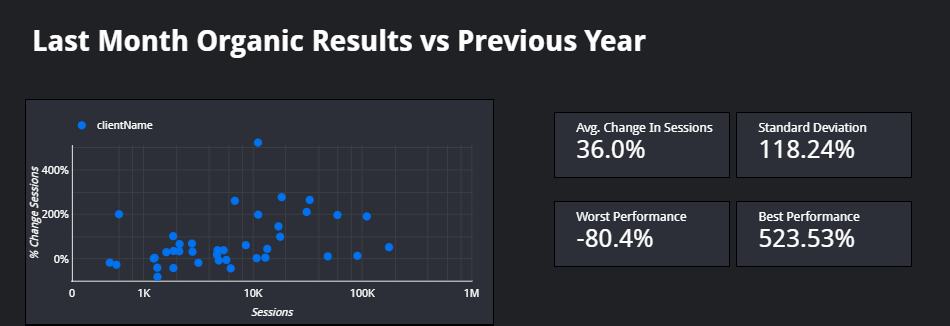
One option for visualizing the data would be to use Pivot Tables in Google Sheets, but importing the data in Google Data Studio gives you the real power to drill down and analyse the performance.
Here we can also express the account data in a scatter chart, allowing us to easily see the highest performing (+523%) and likewise the worst performing (-80%) accounts, and how they compare to the average.

This analysis is powerful when comparing month on month data, quarterly data, and annualized.
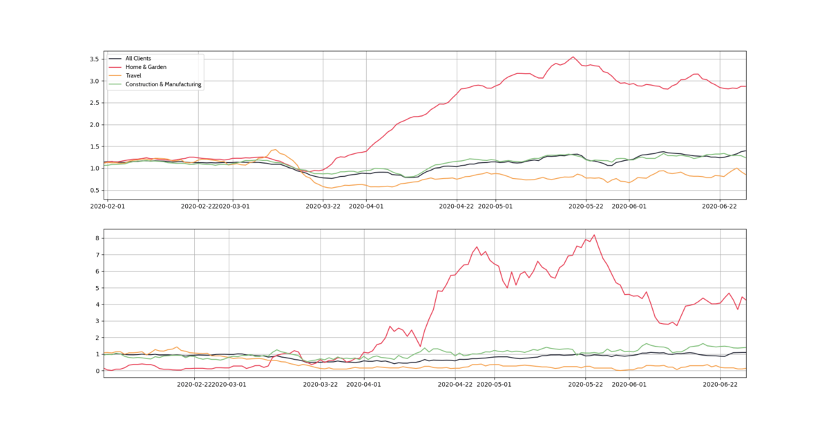
We might also reasonably want to see how that average performance across specific accounts has changed over time or indeed for shorter time periods.
A case study: client performance
For example, it was using this methodology that we first identified the effects of COVID-19 impacting Hallam’s own client performance.
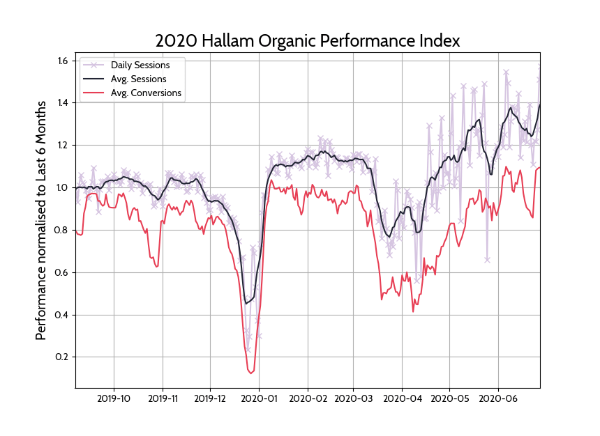
The data clearly demonstrates the crash in traffic at the first moment of lockdown, and the subsequent rebound in traffic and conversions.
In the graph below, we can see the seasonal Christmas dip with an immediate rebound, and then in March the COVID dip, with traffic returning to normal or higher levels within a few weeks.
 Next steps
I’ve introduced the concept of aggregating data using the Google API interface using Google Sheets and Data Studio. I’ve shared some straight forward statistical techniques to ensure you are getting sensible numbers to analyse. And I’ve given an insight into how we are using the data to review and analyse our own client performance across multiple Analytics accounts.
Your next step? Have a go! And if you prefer…. get in touch and we can give you a hand.
Get your copy of our Google Analytics custom report templates
We’ve created custom report templates for you to get Day of the Week, and Hour of the Day reports.
Get your free templates now:


